The Remarkable Remodel

This project is so near and dear to my heart because these wonderful clients have been with my business from the beginning. We originally started the design process working through smaller styling projects in their home, but as time went on we decided to tackle some of the larger spaces in their home. When my clients contacted me about a kitchen and primary bathroom remodel, I was eager to begin. 

KITCHEN, BEFORE

KITCHEN, BEFORE

KITCHEN, BEFORE

Getting Started 

We began this project discussing the layout of the space. The previous kitchen design had a few different angles between the walls and an awkwardly shaped island in the center that was disrupting the flow of the kitchen. Our goal was to work off of the existing angles of the walls in order to create a more functional island. It was also important that we dropped the entire height of the island down to counter height to open up the space. 

We had a few other existing architectural elements we needed to work around. My clients had a gorgeous wood clad ceiling, but the existing beams were in the same stain so they faded into the mix because of the grand scale of the room. There was also a smaller supporting wall in the center of the room that housed quite a few things for the kitchen and lower level of the home that we needed to work around. My rule of thumb with design is if there is something that you can’t change or move, then you should consider celebrating it instead of trying to hide it. For this particular remodel, we needed a material to update both fireplaces in the home. We found a beautiful stone from Realstone Systems that became our design lead for the spaces, but more importantly, we chose to use this material to highlight the wall in the kitchen and create a focal design piece. 


Material Selections

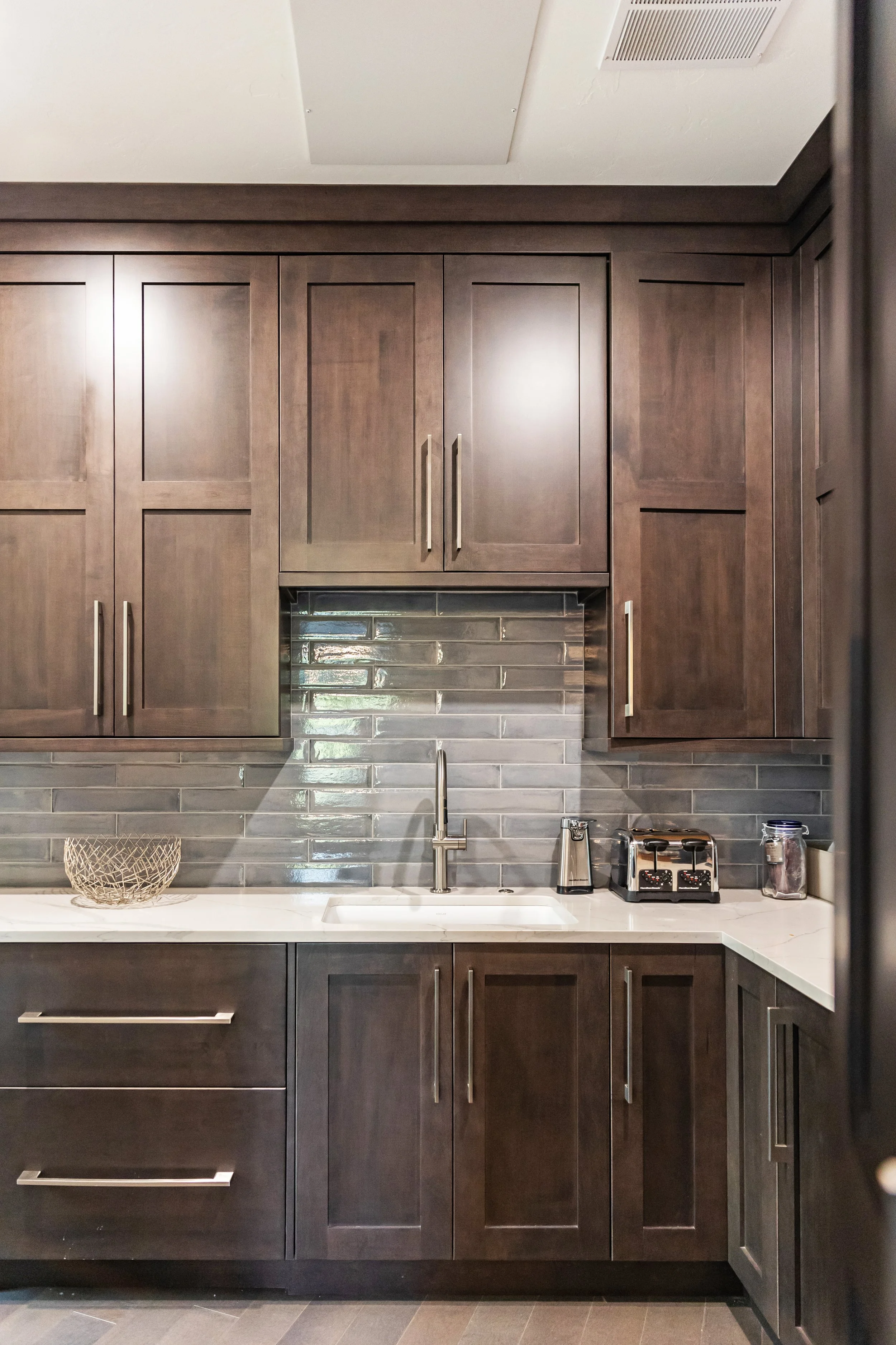
With the stone selection made, we needed to find materials for the rest of the kitchen. We started our search with the cabinet selection, because that is one of the most critical decisions in a kitchen remodel. We found the most gorgeous knotty alder cabinets from Bridgewood Cabinetry. The grain of the wood has some rustic touches to it, but the clean lines of the door profile make this cabinet the perfect selection for the mountain modern kitchen renovation. We wanted to add some dimension to the project, so we opted for two different countertop selections. The first was a focal for the island centerpiece. This quartz selection has large veining which we used to make a statement and add visual interest. The secondary surrounding quartz tied into the color scheme of the first selection, but had a more subtle pattern to it. We also selected a darker colored beam wrap for the ceiling to contrast the existing ceiling stain and to draw the eye up. We added in extra faux beams to make a bigger impact in the space as well. We kept the floor and backsplash tile a little more subtle as to not distract from the focal pieces we had already selected for the space.

My clients love to cook and entertain so finding the perfect appliances was a must for this project. We fell in love with the look and functionality of the GE Monogram line of appliances and the 48” Pro Range was the perfect solution for holiday entertaining.

Kitchen materials

The Details

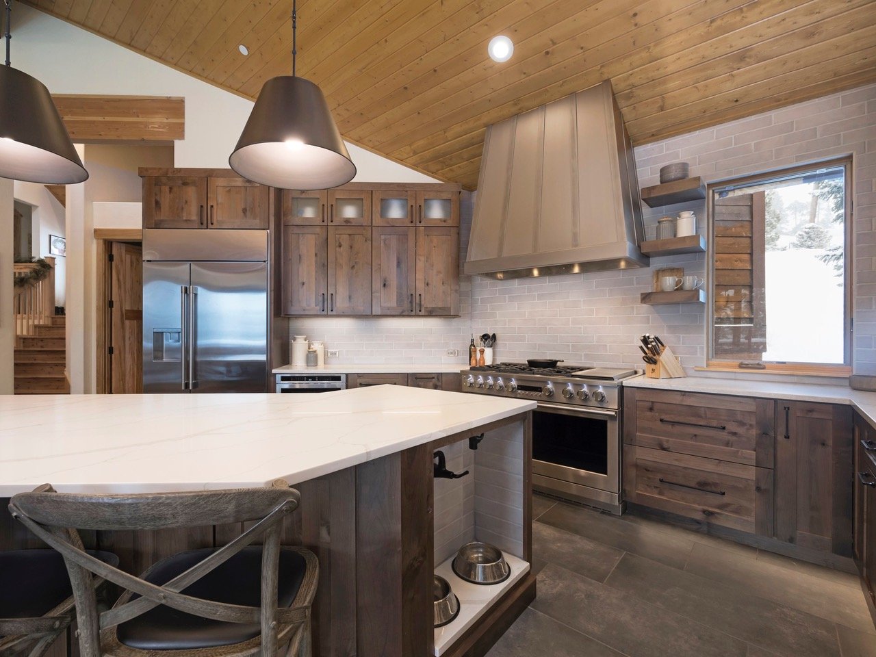
Design is ALL in the details. It was very important that this space was a reflection of my client’s style and taste, but it also needed to be functional for all of the members of the family; the four-legged ones included. One of my favorite details of this space is the built-in dog bowls on the edge of the island. We made sure to include a pot-filler faucet to allow for convenient water bowl refills and a quartz countertop ledge for easy cleanups. 

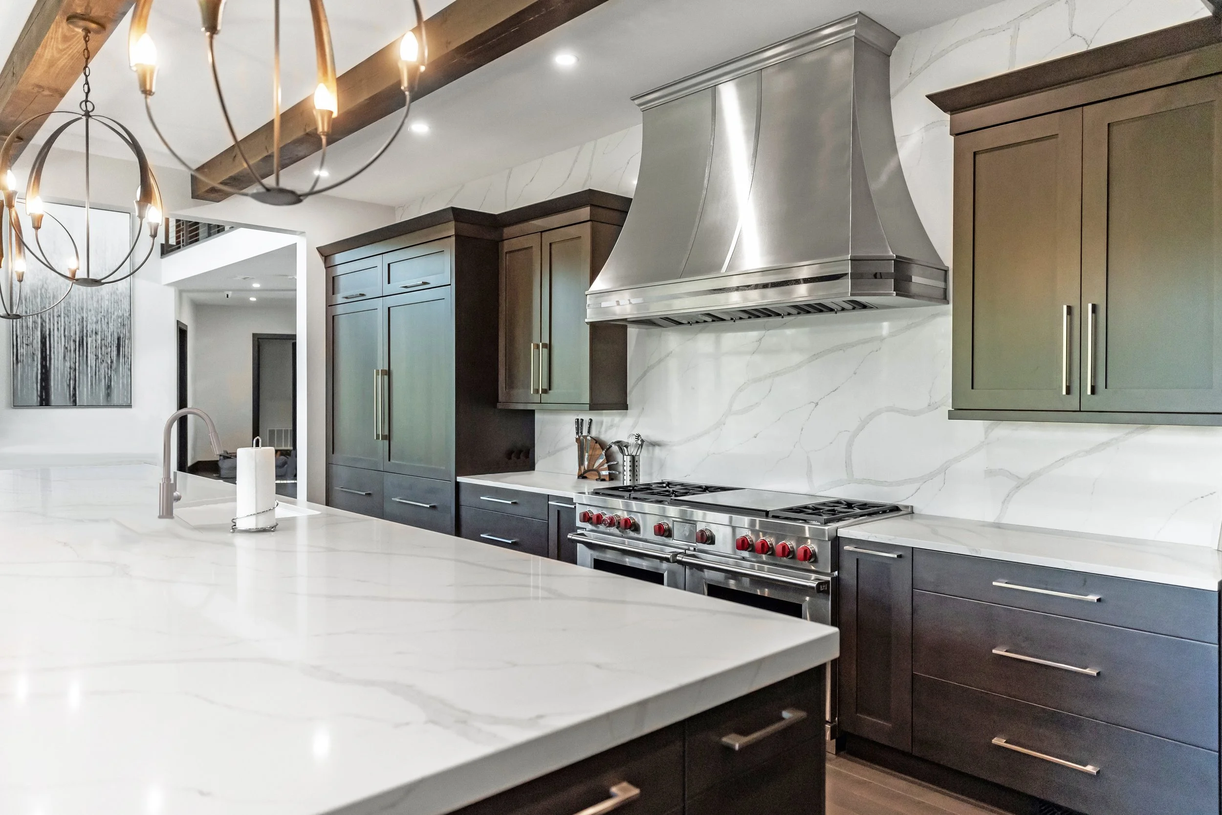
My most favorite detail is the custom range hood we had fabricated for this project. We wanted a tone-on-tone mix of metals for a subtle contrast, but the height and scale added such an impact and made for an amazing focal point for this space. We also included in a drink fridge for extra soda and juice storage for entertaining. My clients, like myself, are big coffee drinkers so having a dedicated space for their coffee maker and mug collection was important. We added in a large pantry cabinet with roll-out drawers to make storage easy and convenient. 

The final additions of specialty lighting, open display shelving, wooden barstools, a touch-activated faucet, satin etched upper glass cabinets, and pop-up power outlets are the details that made this kitchen one-of-a-kind and the perfect space for my clients to enjoy for years to come. 

Remodeled KITCHEN, PHOTO BY Joe Kusumoto Photography

Remodeled KITCHEN, PHOTO BY Joe Kusumoto Photography

Remodeled KITCHEN, PHOTO BY Joe Kusumoto Photography

Remodeled KITCHEN, PHOTO BY Joe Kusumoto Photography

COFFEE BAR,  PHOTO BY Joe Kusumoto Photography

BUILT-IN DOG BOWLS, PHOTO BY Joe Kusumoto Photography

The Primary Bathroom

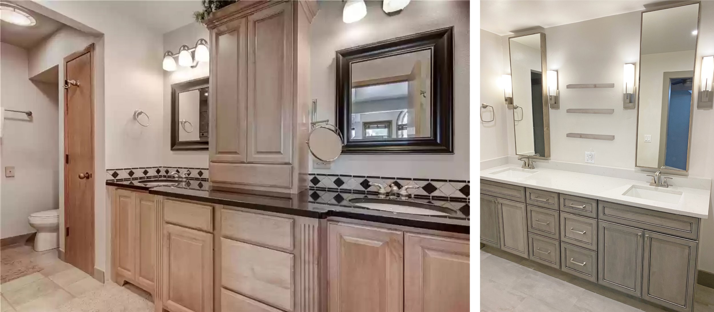
Let’s not forget about the second part of this major renovation… the primary bathroom! We opted to use the same cabinets in this space because we all just loved the style, stain and quality of these for the home. This space also required a new design layout because we wanted to eliminate the oversized built-in tub that was difficult and unsafe to access. We decided to swap the locations of the bathtub and shower to allow for more space for a larger shower and that decision gave us a specialty niche to house a new freestanding tub. 

PRIMARY BATHROOM, BEFORE

PRIMARY BATHROOM, BEFORE

We selected a range of tiles that had some great texture and dimension, but made sure all of the materials came in matte finish for a more classic look to tie into the existing materials as well as the style and location of the home. One of the challenges of this space was the secondary door into the room. The door opening was in the center of the room and blocked the flow to the vanity. Our solution was to install a custom barn door, but we matched the stain and style of the door to the existing woodwork and doors for a seamless transition. 

PRIMARY BATHROOM MATERIALS

We added in some focal sconce lighting, tall mirrors to draw the eye up and a center cabinet for additional storage and functionality. We opted for floating shelves in the vanity as well as near the shower for display space and easy accessibility to towels and bathroom accessories. Since we grew the size and space within the shower, we had extra room for a floating, focal bench made from our countertop quartz. We also custom designed niches for shampoo and soap storage. 

My favorite area of this space is the bathtub niche. We added in a focal chandelier and a bath caddy to add to the beauty and relaxation level of this space. We used a mirror to bounce the light from the chandelier around the room and added in some custom-stained shiplap to tie into the wood of the new vanity. 

REMODELED VANITY, PHOTO BY Joe Kusumoto Photography

REMODELED BATHROOM, PHOTO BY Joe Kusumoto Photography

REMODELED BATHROOM, PHOTO BY Joe Kusumoto Photography

REMODELED tub, PHOTO BY Joe Kusumoto Photography

barn door, PHOTO BY Joe Kusumoto Photography

The goal is always to create spaces that are unique, yet timeless, so each detail comes together seamlessly to enhance the beauty of our clients homes. We hope our client loves these spaces for years to come and spends lots of time enjoying this renovation as much as we did designing it. 

Creating Cora’s Nursery

It seems like just yesterday I was writing this same blog to reveal Ayla’s nursery and now, here we are, two years later and welcoming our second precious baby girl, Cora. I have had the wonderful opportunity to create several nurseries for many of my clients, but there is something so amazing about getting the chance to do it for my own girls. I get to add an extra layer of personalization and love to these special spaces with the added benefit of enjoying and spending so much time in these rooms for many years to come.

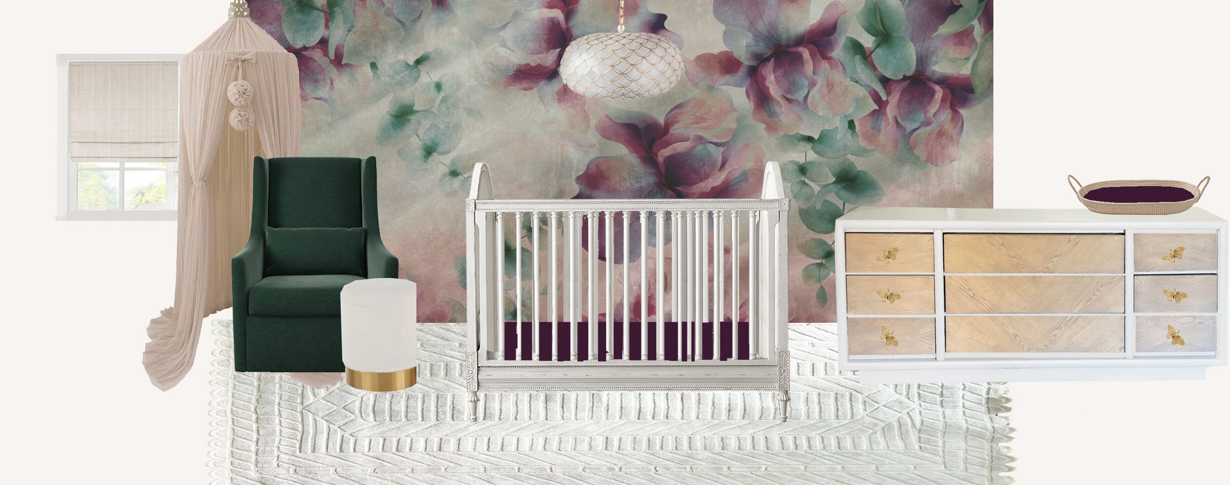
Cora’s room was a little easier to design because I already had a few elements I knew I wanted to incorporate into the design like Ayla’s beautiful crib, the emerald green chair, and a canopy I had ordered for Ayla and never used. This meant that my color palette to begin was green and champagne. I wanted a unique pop of color for Cora that had a moody feel to it. I tried a few different colors before deciding to go with a darker purple with some red and pink undertones to it. Once I found the feature wallpaper, I knew exactly how I wanted this room to look.

rendering

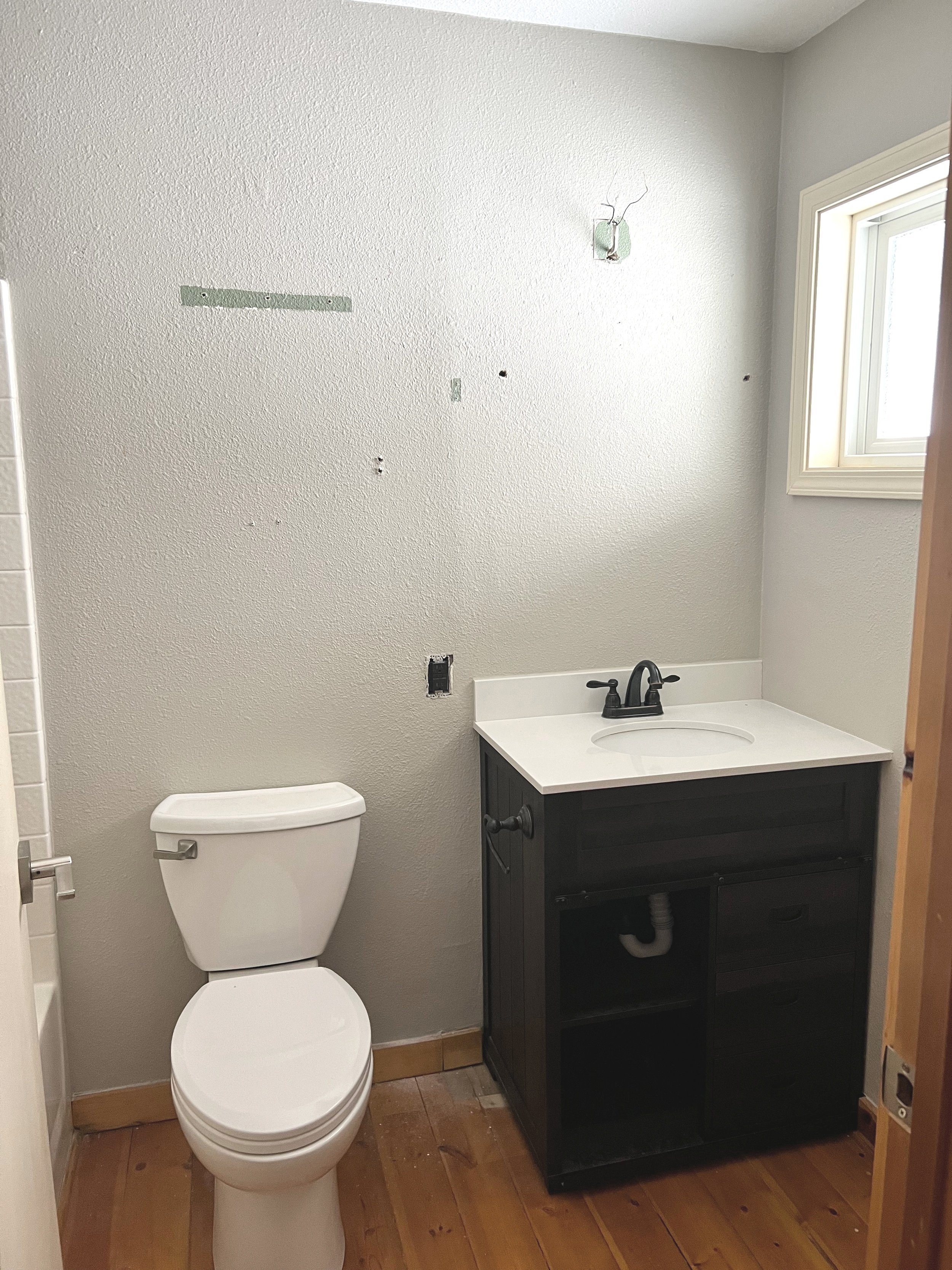
I always start off with a design lead, whether it is a wallpaper sample, a rug, a piece of artwork, or some other color or pattern because this material helps me to make every design choice for the rest of the space. With my wallpaper selection made and the larger elements decided on, we decided to update some of the existing elements of the room. We wanted to replace the baseboards with 5” white shaker style baseboards, re-texture the walls to a light skip-trowel texture to match the rest of the house, update the closets, paint, and give the bathroom a feminine facelift. 

ROOM & BATHROOM BEFORE

We decided to hire some help with the larger construction projects like demo, texturing and paint to reduce the stress of finding time to do this ourselves with a toddler running around. As much as we were hoping this would be a smooth process, we all know it never is. Ryan and I tried to take on replacing floors and re-texuring other bedrooms at the same time and our house became pretty chaotic for a few weeks. We also had some issues with our handyman and ended up having to touch up the texture and paint in a lot of spaces ourselves. Once we got through that hurdle though, the fun began!

UNDER CONSTRUCTION

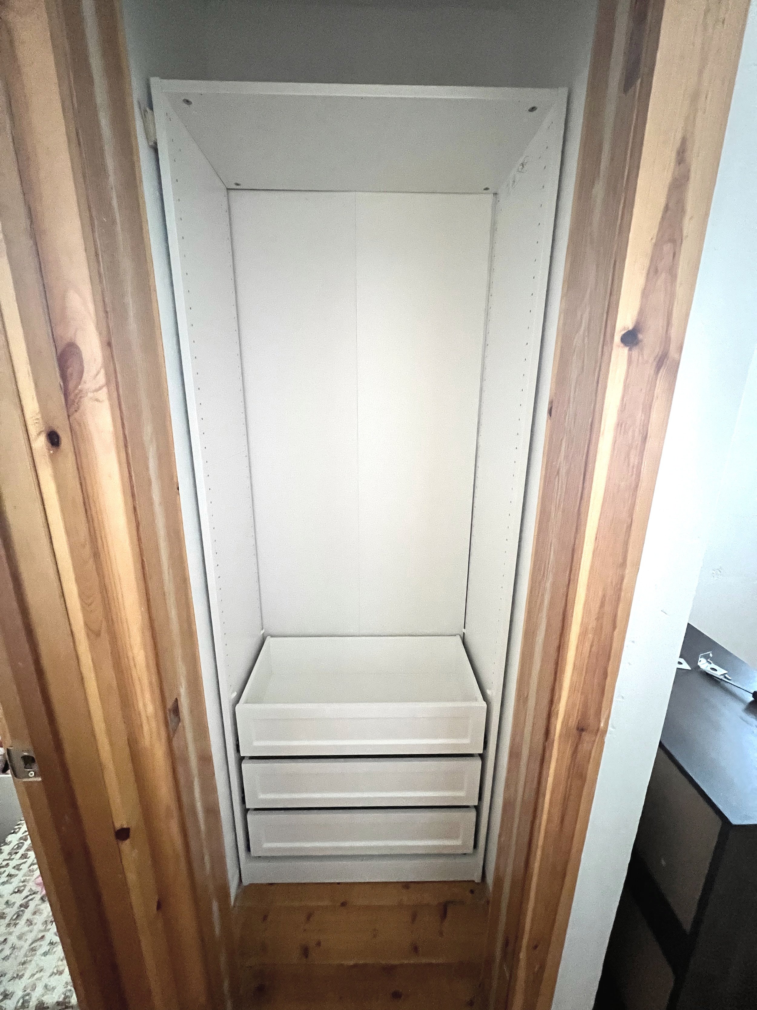
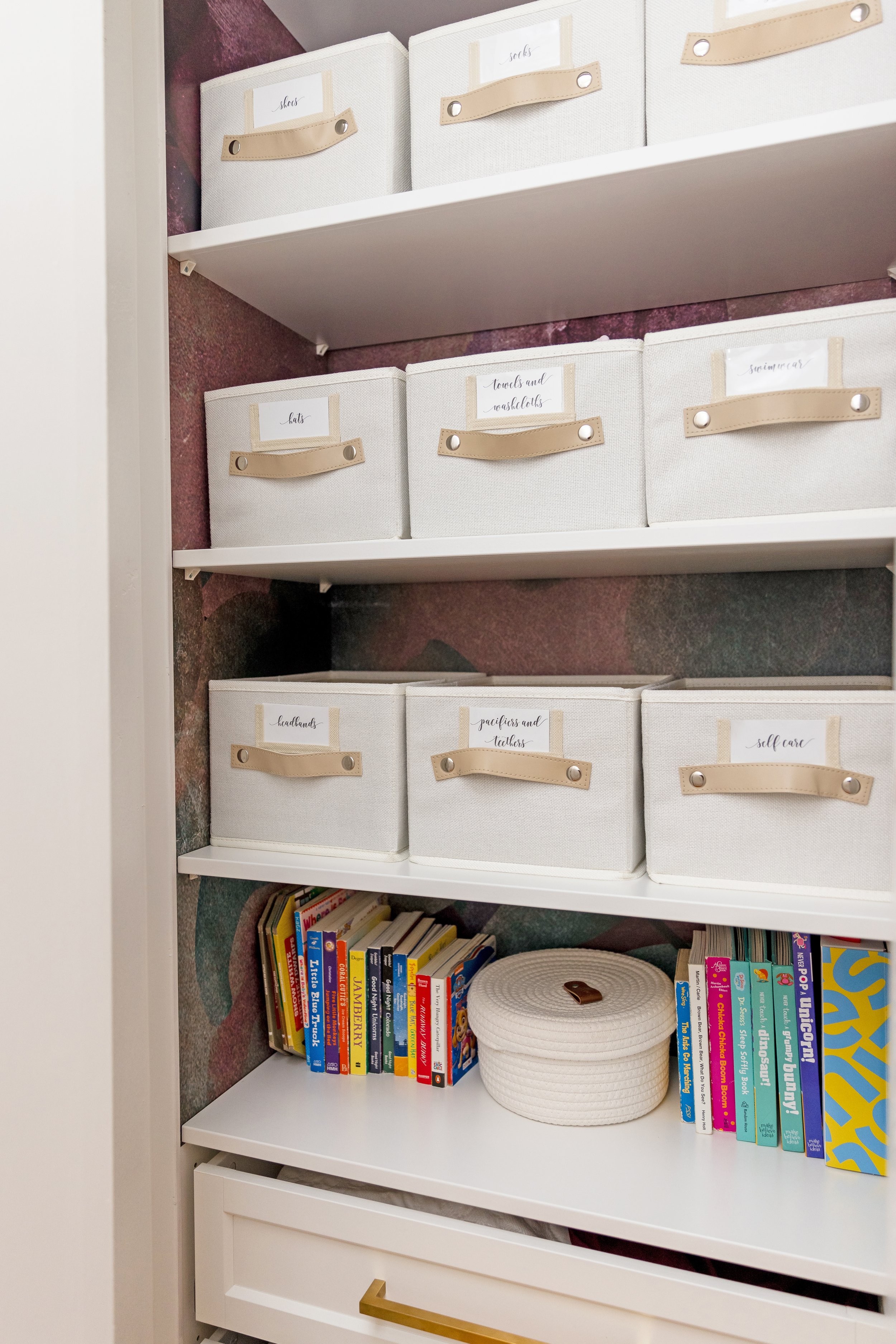
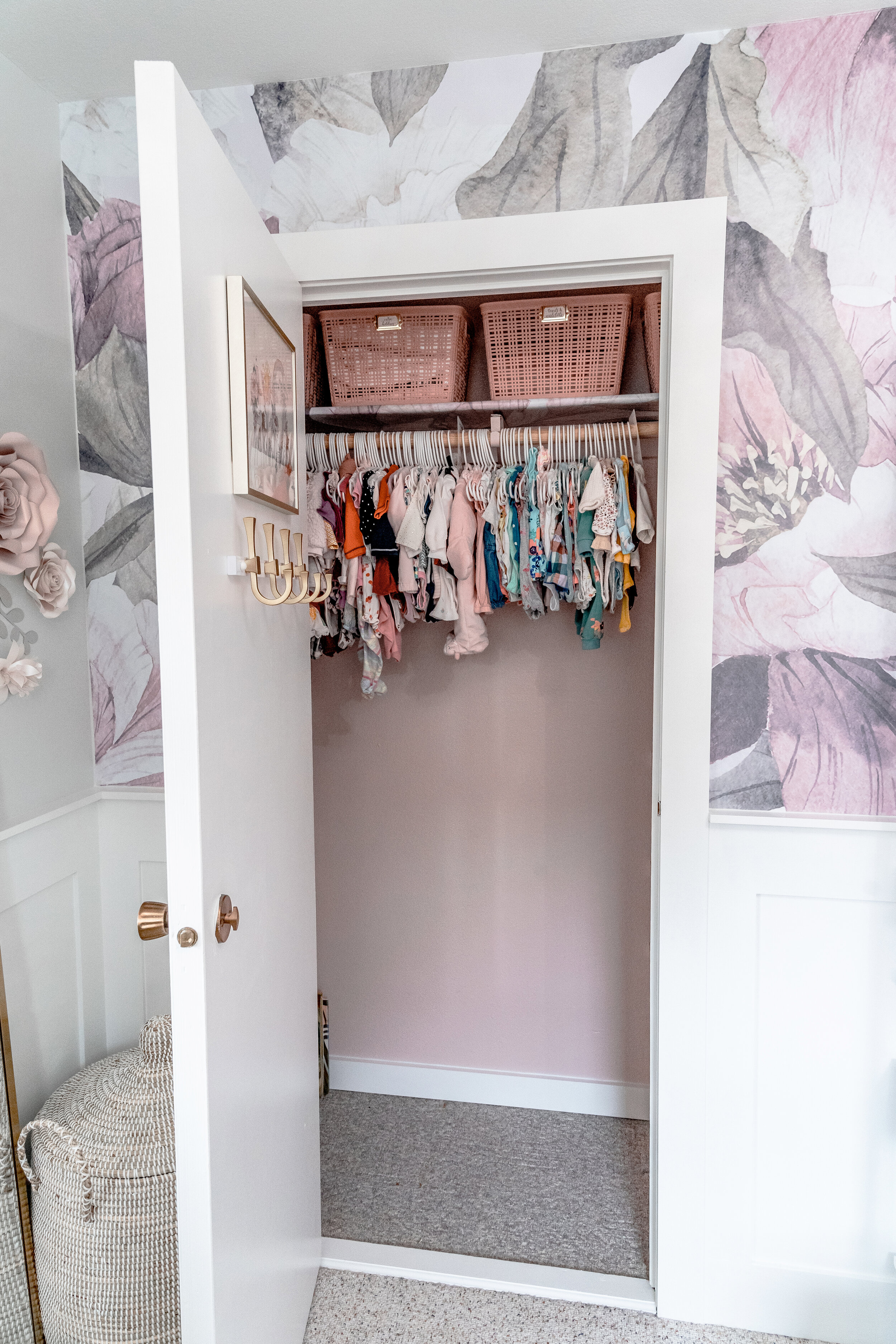
We started with the bathroom and closets to get those back to being functional as we still had company visiting us throughout the springtime. We replaced the vanity, sink, faucet, mirror, lighting, and shower plumbing. We had a ton of help from both of Cora’s Grandpas, her daddy and her Uncle Eddie to get these pieces installed. Cora’s grandpa or “Op” also put in all of the new trim work and helped get the bright white paint on all the doors and trim. Next up were the closets. The previous closets only had a single hanging rod and some wire shelving that was falling apart. We ended up inserting an IKEA unit in one closet that had open shelving for baskets and drawers to store bedding. I highly recommend considering the angle of the closet and the opening of the door before ordering a closet system that fits within an inch of the entire closet width. I blame pregnancy brain for this one but I was able to squeeze into the closet and build the system inside and make it work! Whew! We used some trim pieces to finish it off and I added in the leftover wallpaper to line the back of the shelves. We installed two shelves with rods in the other closet to double the storage because we knew we were going to need it with all of the clothes we have for our baby girl!

CLOSET SYSTEM

WALLPAPER & BASKETS

I also took on the huge project of the wallpaper installation. I will say, peel-and-stick wallpaper is not a huge time commitment project, but it is stressful if the seams don’t line up or if you end up with a lot of bubbles. Thankfully I had some experience in this area from Ayla’s room so it wasn’t too difficult, but if you can hire someone to install this for you- I would highly recommend it!

FEATURE WALL BEFORE

FEATURE WALL AFTER

Once we completed these items we were FINALLY ready to start my favorite part- decorating! I assembled the crib, moved in the chair and canopy and selected a beautiful creamy rug to cover most of the room. I decided to also do a fun custom dresser project like I did for Ayla in this room as well. Instead of going out and finding a dresser to paint, we ended up upgrading our primary bedroom dresser to a solid wood piece and I refinished our old dresser a second time to fit in this space. I painted the shell of the dresser white to match the trim and doors. For a fun ‘pop’ I painted the base trim gold to match the hardware I had selected. Finally, I used a combination of paint and water to create this creamy greige stain on the drawers. I thought the overall look was a fun mix of glam and boho and tied the room together well. 

TOP ROW: ORIGINAL DRESSER FROM HABITAT FOR HUMANITY (TOP LEFT IMAGE), DRESSER REFINISHED FOR OUR BEDROOM 4 YEARS AGO (TOP RIGHT IMAGE). BOTTOM ROW: DRESSER PAINTED WHITE FOR CORA (BOTTOM LEFT IMAGE), CUSTOM WATER/PAINT STAIN NEXT TO ORIGINAL FINISH (BOTTOM MIDDLE PICTURE), FINISHED LOOK (BOTTOM RIGHT IMAGE)

There is absolutely no greater joy for me than to see a design vision come to life. This room is so special to me in so many ways and I could not be happier with the end result. 

I wanted the artwork in the space to reflect the wallpaper design and give a little nod to our home in the mountains. I selected some beautiful watercolor mountain photos to flank the windows and some greenery prints to go on either side of the dresser. I have found myself being drawn to butterflies in this space so I wanted the statement art piece to be a butterfly. I tried to create one on my own on a canvas but I have to remind myself that I am a designer, not an artist. With my creation being scrapped, I ended up ordering this print and I just hit it with a little bit of the raspberry purple color tones I used in the room to tie it to the rest of the space. I also knew I wanted some floating shelves to display some sentimental pieces. The shelves display a musical carousel horse snow globe that was my sisters growing up and matches one that I have in Ayla’s room. I also selected a custom piece of artwork of the mountains hand-painted by a local artist. Cora’s shelves also have a picture of her big sister and a wooden heart that she painted for her. Finally, I included an adorable name puzzle given to Cora by her great grandmother, Nana, and a castle piggy bank from her other great grandmother, Barb, and her Aunt San.

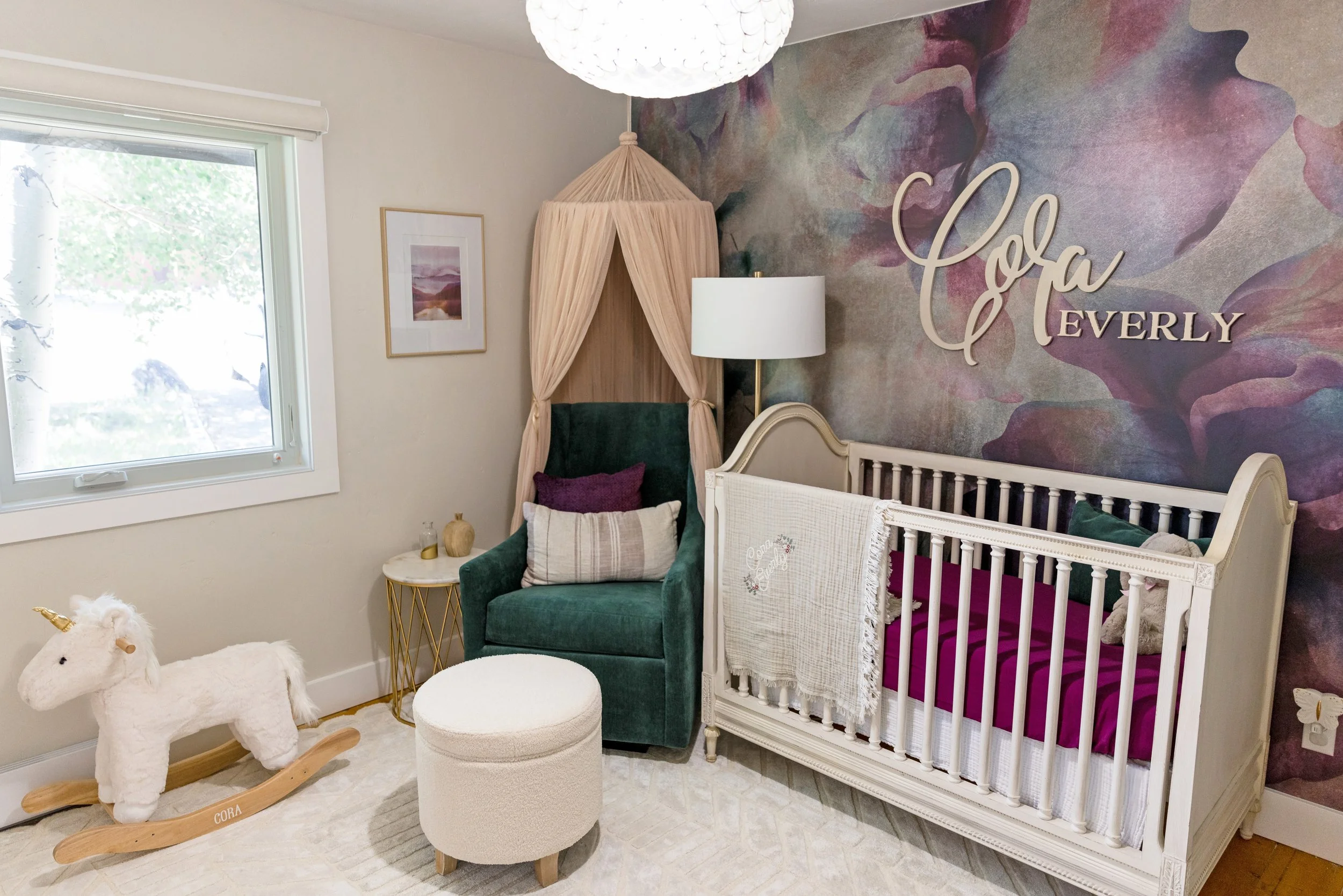
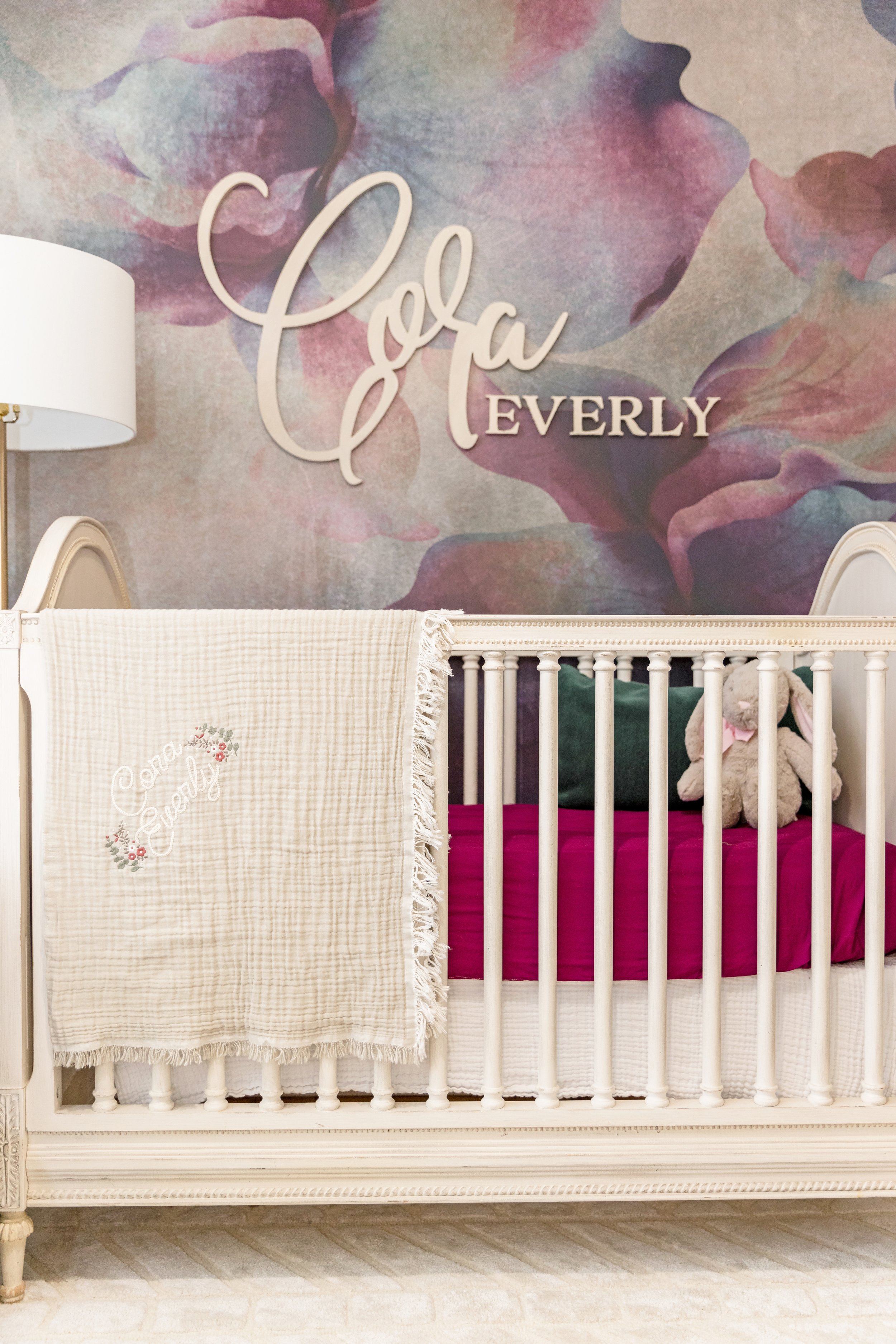
Some of the final details included a gorgeous statement capiz scalloped chandelier, a beautiful rocking unicorn from her grandma, Didi, and a rattan toy box with her name on it from her Grandpa. My all time favorite element of the room is the gorgeous wood letters that display her name so perfectly on her feature wall. This was a special gift from her Aunt Ashley and Uncle Eddie. It was the perfect way to tie in all the wood elements and personalize her space. I love that we can look around the room and have a special way to think about all of the wonderful family and friends that already love this sweet girl so much and know the sentimental value that each item holds.

fLOATING SHELVES

DRESSER/ART DETAIL

CRIB

When it comes to my family, I do everything with love and there is no detail overlooked when it comes to creating the perfect space for them. I had so much fun designing this space for my baby girl and we are so excited to share so many wonderful memories together here. I love sitting in her room and thinking of all of the precious moments she will spend rocking in my arms and all of the special times we have to look forward to as a family. Pregnancy is not an easy journey, but it is so worth it when you get to hold your baby in your arms for the first time.

Cora Everly Parr was born on August 1st at 4:38PM weighing 6 pounds 15 ounces and measuring 18.5 inches long. She has beautiful blue eyes and a full head of hair. We are so in love and soaking in every moment as a family of four. Ayla is loving having a real life baby doll and is already stepping up to her duties as big sister. We are truly blessed beyond belief and can’t wait to make so many beautiful memories together.

Style With Tile

Remember that time you made a reservation at a 5-star Yelp Reviewed restaurant? At some point, it was time for a restroom break. You walk through that door and were immediately greeted with bold, bright, unique tile- you just had to take a bathroom selfie and send it to your friends immediately! We’ve all been there. Trending tile is taking the design world by storm. They are more fashionable than ever and if you can dream it, it can be found. I write this with confidence because there are even studios where you can go in and design your very own personal tiles. I always have a field day at the tile store, walking around and absorbing all the colors, patterns, and textures.

Tiled Entryways

It doesn’t get more bold than this- a tiled entry. Whether you opt for a unique, hand-painted concrete tile outdoors or a sophisticated herringbone entryway, it’s a welcoming way to express your home artistically. Tile is low maintenance and easy to clean, so it’s no wonder we are seeing more of this near the front door.

Photo Via Optimant Lighting

Photo Via HGTV

Tiled Flooring

Having tile flooring is not a new concept, however, homeowners are opting to replace their 1970’s square tile with hexagons, 12x24 field tile, penny tiles, and more. Many of our classic rectangular tiles can be traded for the same colors in various fun shapes. Also, who would’ve known transitions could be such a statement? We are seeing tile line up to carpet via schluter, as well as tile integrating itself with dynamic cuts of wood flooring. There are a lot of opportunities to get creative with floor tile.

Photo Via Apartment Therapy

Photo Via Apartment Therapy

Kitchen Backsplash Tile

Having tile as your kitchen backsplash is not just a design choice; it also serves an important purpose. It prevents moisture from water, grease, and food from damaging your walls. Drywall is not made to get wet, so tile acts as a protective barrier. While the practical properties are great, backsplash tile is also a brilliant way to add a pop of color, texture or to compliment your countertops.

Photo Via Sheer Interiors

Backyard Tiled Patio

This concept has come a long way from giant concrete pavers you may be used to seeing (which still have a time and a place to shine). Many manufacturers are offering the same intriguing options that you would find indoors but now have selections that have the durability to withstand the outdoors. A tiled patio is also easy to maintain and easy to clean.

Photo Via Paper & Stitch

Photo Via 100 Layer Cake

Needless to say, tile can go anywhere inside or outside of your home. It can be found in every shape imaginable and in unsurmountable textures and colors. They can be used to accentuate cabinetry or stand out as the show piece of your kitchen. They can flow seamlessly from the floor into the shower or can be used to cover entire walls. Subtle, loud, simple, or bold- we love playing with tile.

Written by nicole marines

Retreat on the River

Nestled right on the river in Rock County, Wisconsin, this exquisite custom home is certainly a sight to behold. This 16,000+ sq.ft. beauty involved a specialized team of architects, builders, and designers to complete, and we were so honored to be a part of the planning and development of our client’s dream home. It all started with the selection of the exterior materials to highlight the captivating architecture and picturesque scenery of this home. 

This home boasts so many intriguing details to showcase, it is hard to select just a few spaces to highlight. When it comes to selecting materials for a home of this caliber, it always helps to start with the main living spaces like the kitchen and living room. Right as you enter the home, you come face-to-face with this exceptional three-story staircase. The floating steps are custom stained in a darker finish to contrast the hard maple engineered hardwood floors that run throughout the main level. We custom-built the stair rails and selected a contemporary honed stacked stone to highlight the wall behind the stairs. We also carried this stone on to the living room fireplace for continuity. The fireplace has a tailor-made mantle and hearth detail created from a matte finish quartz stone. Even the beams on the ceiling in the living space were designed by hand to reflect the architecture of the home and the angles of the windows. 

One of the main showpieces of this home has got to to be the kitchen. This was such an intriguing space to design. One of the main challenges of this space was trying to find a way to allow the homeowners and their guests to not only take advantage of the stunning river views out of the floor to ceiling windows, but to also have island seating facing the work zone of the kitchen for entertaining. This is where the floating window island idea was born. We were able to create a live-edge wood slab countertop that mounted right over the window for optimal views outside and a quiet space to have a cup of coffee. 

When it came to the kitchen, it was important to keep the materials minimal and in line with the rest of the home. We selected a maple cabinet because the clean lines and tight grain of the wood lended itself well to the overall design and the flooring selection. The stain was a proprietary color to the cabinet company we worked with and is one of their best sellers. The most jaw-dropping element in this space has got to be the two book-end quartz slabs on the island. We selected the island size based on the dimensions of these two slabs so that they would perfectly meet in the center to create a seamless look. This entire island is over 18’ long. The quartz was such a stunning element that we had to run it up the wall as the backsplash as well. This space would not be complete without a custom-made range hood, luxury appliances, and architectural beams throughout. 

One of the most unique elements of this kitchen is the hidden pantry design. We were able to incorporate the door to the pantry into the run of cabinets on the wall for a smooth transition between the two spaces. The pantry carries the same cabinet design, but we selected a subway tile backsplash to differentiate this space from the main kitchen. 

This home has so many incredible features that we could showcase. There is a floating catwalk leading to a private office, a bowling alley, a theater room with a custom star lit ceiling design, a wine room, a gaming space, a trophy room with an attached Irish-style pub and bar, secret doors and hidden rooms, and a three-story slide which is pictured below. If you are interested in checking out the rest of these amazing spaces and seeing more of this incredible home, follow us on social media and stay tuned as we share more on Facebook and Instagram!

Breckenridge Beauty

Nestled in the heart of downtown Breckenridge, you will find the perfect ski town home-away-from-home. The only problem…? It needed a little TLC! Thankfully the layout of the home was already functioning well, it really just needed an interior facelift. 

We started by demolishing nearly the entire interior and, in some areas, we took it down to the studs. We had to relocate some plumbing, take out some old heaters, and move some lighting in order to raise the ceilings in some areas. It was well worth it because the whole aesthetics of the home felt so much more spacious and we increased the function of several spaces.

Throughout the home we selected a Luxury Vinyl Plank which looks and feels like hardwood, but is 100% waterproof which is critical to not only have in a rental space, but also to have in a place where we have eight months of snow. We also replaced the baseboards with 5-1/2” dark painted boards and selected a stunning medium-toned stained knotty alder wood for the doors and beam wraps. This really modernized the whole space.

The main living area had the most significant change of the whole house. We updated the kitchen with new knotty alder shaker style cabinets, quartz countertops with matching backsplash, and took all of the knee walls down to be at counter height. We also raised the ceiling and removed the tongue-and-groove. This made the whole interior feel lighter and brighter. In the living room, we updated the fireplace with new stone and a floating mantle. 

We painted and applied new wall texture throughout the home and updated all of the lighting fixtures to highlight the new mountain modern look. All four of the bathrooms received new cabinets, countertops, tile, and lighting. There was nothing left untouched! 

Finally, we came in and added all new furnishings throughout. We added new hardwood furniture in the master bedroom and guest rooms. We were able to repurpose the old bunk beds in the kid’s room. We also kept the loft area sleeper sofa so it could double as a theater room. The living room has performance fabric sofas so they will hold up over time with renters. we also found a gorgeous wood dining table with wishbone chairs to compliment the kitchen design. One of my favorite elements of this project was the artwork. We created some beautiful vignettes and collage walls using some unique, local art and some of my client’s personal skiing pictures. 

This home is not only the perfect getaway for my clients but is also a luxury rental property with gorgeous views of the slopes. The interiors are a perfect balance of the rustic touches you expect to see in the mountains while still encompassing the modern, Scandinavian timeless design that will last for years to come.  

PHOTOGRAPHY VIA SUMMIT MULTIMEDIA

Creating Ayla's Nursery

For so long in my life I dreamed of having a family. Once I met my amazing husband, Ryan, I knew my dreams would finally come true. When we found out that we were having a baby girl, we were SO overjoyed! Once we announced our exciting news to our friends and family, I could not wait to start designing her nursery. 

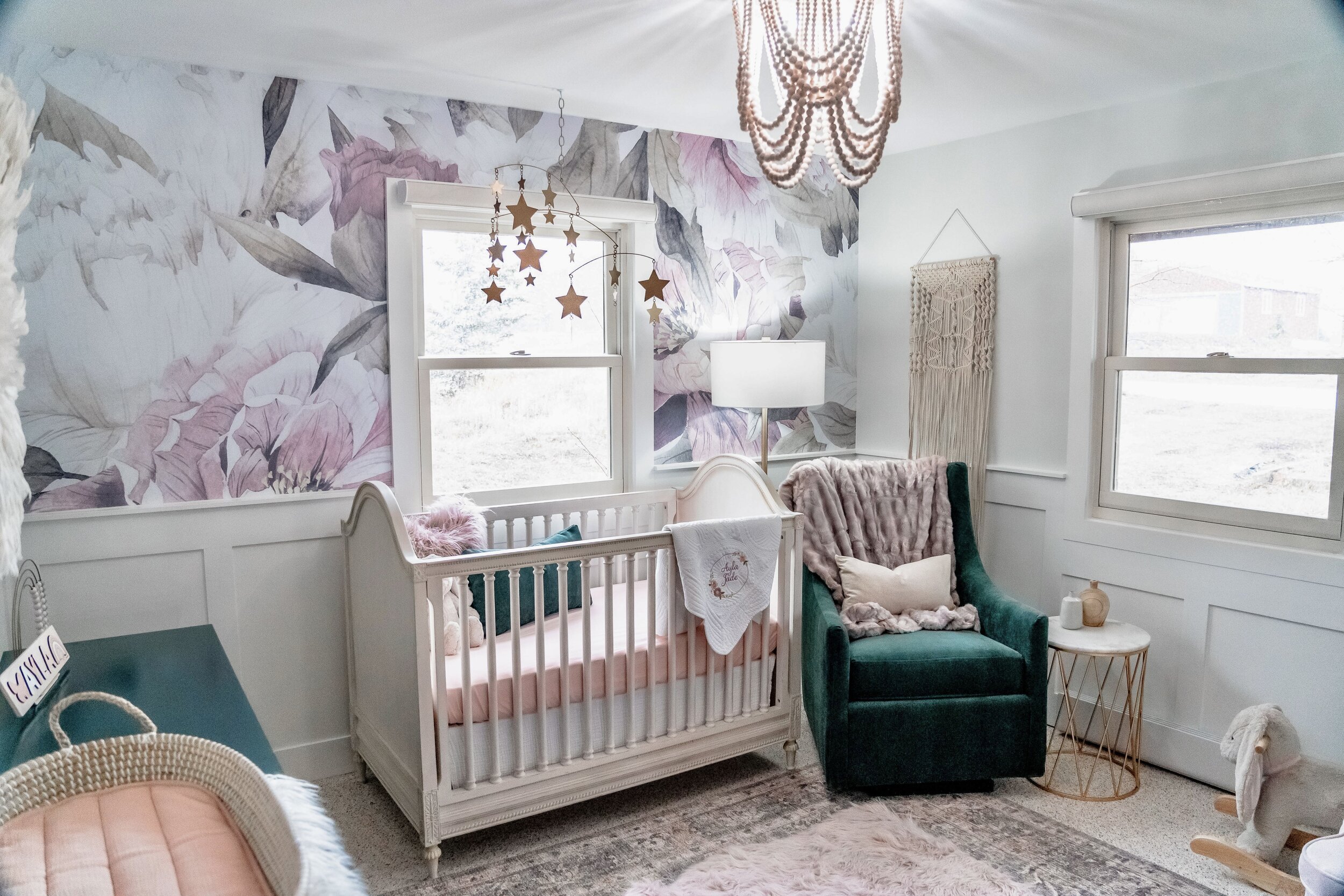
The first thing I knew I wanted to have as a feature design element in the space was A beautiful, floral wallpaper. I started the design process by creating a mockup of a few concepts that included some wallpaper designs that caught my eye. Once I finally made a selection on the wallpaper, I knew it would look great to break up the large pattern with a shaker style wainscoting throughout the room. We also had a beautiful off-white crib in the family, so I started designing the room around these elements. Finally, I really wanted to have a bold, rich, non-traditional nursery color in the mix as well, so I decided to incorporate emerald green into the design with the glider chair and dresser. Once I fell in love with the design concept, it was time to get started. 

Design Concept

Design Concept

The Room Before

The Room Before

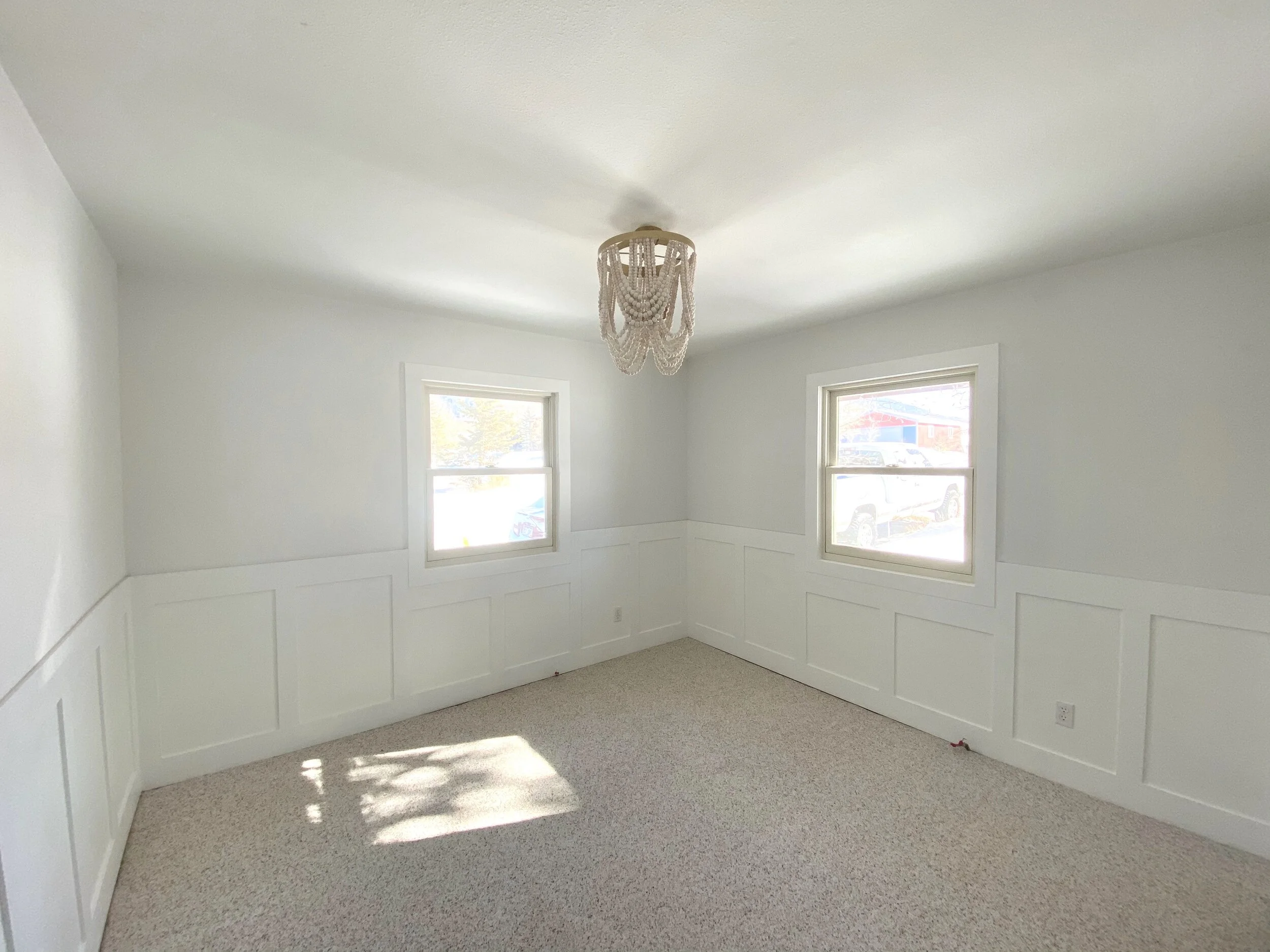
Once the room was cleared out, we started with the wainscoting detail and skimming the walls in preparation for the wallpaper. Ryan and his father installed the wainscoting throughout the room and also replaced the window and door trim as well as the baseboards to give the room more architectural detail.

Dad, Grandpa and Peyton working on the Wainscoting

Dad, Grandpa and Peyton working on the Wainscoting

Dad and Grandpa Installing the Trim

Dad and Grandpa Installing the Trim

Wainscoting Ready for Paint

Wainscoting Ready for Paint

Next, we needed to install a light fixture. My father was able to run some wire and mount the beautiful beaded chandelier for us. We were so thrilled to have both of her Grandpas help out!

Grandpa Installing the Chandelier

Grandpa Installing the Chandelier

After the chandelier was hung, Ryan painted the wainscoting and I painted the doors so everything had a fresh and bright new coat of paint. I also decided to do something fun with her closet and gave it a pop of pink on the walls and used the wallpaper to cover the shelves.

Dad Painting the Wainscoting

Dad Painting the Wainscoting

PAINTED Wainscoting AND Doors

PAINTED Wainscoting AND Doors

Working Mama

Working Mama

Completed Paint

Completed Paint

Painted Closet

Painted Closet

Everything was going smooth until it came time to install the peel-and-stick wallpaper. I was very careful to follow every detail of the manufacturer’s directions for installation, but the walls were very dry after the primer coat and there was no way to get the wallpaper smooth and even with the panel next to it. I was devastated because I had planned the entire room around this feature, and I had already ruined several panels with my failed install attempts. I had the ‘genius’ idea that I was going to use the remaining panels as a stencil and try to hand paint the mural myself. I was able to get some of the larger flowers painted on nicely but when it came to the smaller details, it was apparent my skills as an artist were lacking. While it was looking pretty good, it was taking FOREVER and Mama was running out of time.

Mural Attempt

Mural Attempt

After some additional research I decided to give the remaining peel-and-stick wallpaper another try with some good old-fashioned Windex as a way to keep the wallpaper wet enough to adjust and line it up. Low and behold, it went RIGHT up using this method! Since I had already ruined some of the panels with my previous install, I only had enough left to put the mural on two walls so I opted to display the wallpaper on the crib wall and the leaning ladder wall since they were opposite of each other in the room. This ended up working out really well because it broke up the large scale of the pattern and allowed me to display some artwork on the remaining walls. 

Completed Wallpaper

Completed Wallpaper

Completed Wallpaper on Crib Wall

Completed Wallpaper on Crib Wall

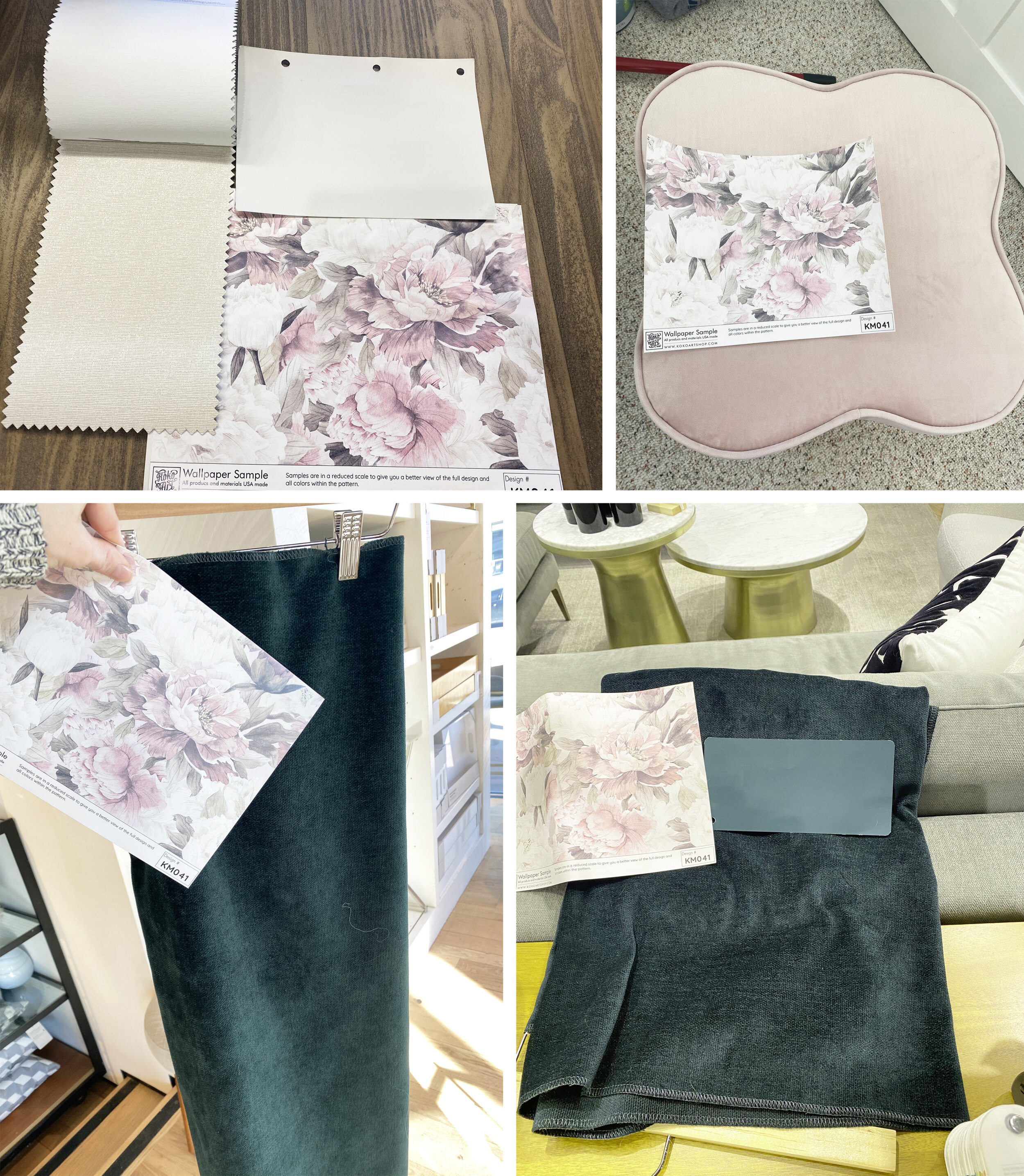
Once we finally had the wallpaper up and the other two walls painted a soft off-white color, it was FINALLY time to decorate! I used the wallpaper sample to find every element in her room and carried it with me everywhere while I was shopping. The most important element to select next was the fabric for the glider chair which was a special gift from Ryan’s parents. Once I found an emerald green velvet fabric that I loved, I used that color to select a paint for the dresser. I also selected the blackout shade fabric and ottoman using the wallpaper sample.

Design Elements

Design Elements

Next, I needed to find a sturdy, solid dresser to paint my emerald green color to match the chair. I found a beautiful piece from Goodwill for only $15! It was extremely heavy and large and wouldn’t fit in my car with the trunk closed, but there was nothing stopping me from bringing this beauty home! After some serious teamwork, we were finally able to get the dresser home for me to refinish. I hand-painted the dresser, used the remaining wallpaper to line the drawers, and selected some gorgeous new matte gold hardware as the finishing touch.

Dresser Makeover

Dresser Makeover

With only a few days to spare, I was able to finally pull the room together and finish the final details of this sweet nursery. I think one of the most important things about design is to go with the flow of the room and not be afraid to make design changes as needed. I could not be happier with the end result of the room for my baby girl and I know she will enjoy this space for years to come. 

Ayla’s Nursery, Dresser & Crib

Ayla’s Nursery, Dresser & Crib

Ayla’s Nursery, Crib & Glider Chair

Ayla’s Nursery, Crib & Glider Chair

Ayla’s Nursery, Leaning Ladder

Ayla’s Nursery, Leaning Ladder

Ayla’s Nursery, Closet Detail

Ayla’s Nursery, Closet Detail

Ayla’s Dresser

Ayla’s Dresser

Ayla’s LEANING LADDER

Ayla’s LEANING LADDER

Ayla’s Crib

Ayla’s Crib

Ayla’s Closet

Ayla’s Closet

Every detail of this room is very special. I was able to include elements from my childhood room in her space like the carousel horse snow globe and teddy bear on her leaning ladder. I also incorporated some special pieces that have a story like the hand-painted Colorado landscape artwork created by a local artist. She also has a special art piece from her Aunt that has her name surrounded by animals native to Colorado. One of my favorite elements is the JuJu feather hat that came all the way from Cameroon, Africa. I am also very fond of the blanket embroidered with her name on it from my mother.

leaning ladder details like the Colorado Artwork & Snow Globe

leaning ladder details like the Colorado Artwork & Snow Globe

‘Ayla’ Artwork with Colorado Animals

‘Ayla’ Artwork with Colorado Animals

Art Wall & JuJu Hat

Art Wall & JuJu Hat

Embroidered Blanket

Embroidered Blanket

Ayla’s Chandelier

Ayla’s Chandelier

I was so grateful to finally be DONE so I could enjoy the last few days before my baby girl arrived. I loved being able to capture a few moments in her room for her to look back on and it was so amazing to enjoy all of the hard work that went into creating this special room for our special girl.

38 Weeks Pregnant

38 Weeks Pregnant

44 Maternity.jpg
45 Maternity.JPG
46 Maternity copy.jpg

Ayla Jade Parr arrived into the world on May 12th at 6:19pm with a whole lot of hair and spunk! She weighed in at 7lbs 3oz and measured 19.5” long. We are so in love with everything about her and are soaking in every moment we can with our precious girl. I wanted to take the time to document all of the hard work and dedication that went into creating this space for our baby girl so she can look back at this one day and see how much love went into preparing for her big arrival. We have already spent so many special moments in this space with Ayla and we look forward to many more. 

47 Last Ayla 1.jpeg

Ayla Jade- we love you so much!

48 Last Ayla 2.jpg

Design Resolutions

Many people choose to make resolutions to improve their life and use the fresh start of the new year to achieve their goals. Often times, you will find people hope to lose weight, learn a new skill, or to improve their finances. While these are all wonderful things to focus on, we should not forget to also work on our interior spaces. If 2020 has taught us anything, it is the value and importance of home and family. I think we should make 2021 the year to improve our homes and I have come up with a few ideas to get you started!

design by remedy design firm

design by remedy design firm

Create a Designated Home Office

If you or your family are STILL are working from your dining room table or kitchen island, it is time to carve out a designated space for a home office. The trend of working from home will only continue to rise in the future and it is very important to have a space where you and your family can be comfortable and focus on your work. 

design by lindye galloway

design by lindye galloway

Remodel a Bathroom

An entire home remodel can be expensive and overwhelming, so sometimes it is best to take it room by room. One of the best places to start is with an outdated bathroom. Give it some new life with updated tile, plumbing and lighting fixtures, and a new vanity. 

design by the container store

design by the container store

Organize your Closet

We are all guilty of neglecting our closets! If you don’t have a built-in closet system, it is time to invest in one! They help to keep your closet organized and while you are pulling out all your clothes for the install, it is the perfect time to go through and get rid of old pieces you no longer want or need! I always tell myself that the more I get rid of, the more there is room for new pieces.

design by rebekah westover interiors

design by rebekah westover interiors

Update your Look

If you have an old, cheap or worn out piece of furniture in your home, it is time to REPLACE it! You do not need to hold on to anything that isn’t adding to the aesthetics of your home. Upholstery is usually one of the items that can get worn down quicker than others so you should consider replacing or reupholstering anything with stains or tears in it.
design via crazy wonderful

design via crazy wonderful

Refinish a Furniture Piece

Some of us have antique pieces, sentimental items, or great curbside finds that may be an eyesore in our home but are worth keeping! If so, it is time to refinish or paint that piece and bring it back to its former glory! I find it can be a lot of fun to get your hands dirty and pour your heart into making an old piece look new again. Check out Pinterest for TONS of great ideas on how to accomplish this!

design by lindye gallloway

design by lindye gallloway

Finish an Incomplete Project

Are any of you guilty of a half-finished project? I think most of us are, so this is the year to finish them! Pick up your hammer and finish building that piece of furniture, hanging that art piece or fixing that plumbing work that is still on your to-do list. With all this extra time spent indoors these days, there is no excuse for a project left unfinished! 

design by krista + home

design by krista + home

Transform a Room

If you have a room in your house that you don’t use very often, consider all the ways you can make it functional again. Whether it becomes a guest room, office, workout room, craft room or a gaming area, find something you can do to make it useful again. If your rooms are all functioning well but haven’t been updated in a while, then it is time to change up your look! Consider finding some new bedding, artwork, accessories, or a paint color change to make an old space look new again. 

design by kathy kuo home

design by kathy kuo home

Deep Clean

This is the most dreaded task for everyone…the deep clean. This is the time where you should get on your hands and knees or bust out the tall ladder and get to work! I am talking about cleaning baseboards, tops of cabinets, ceiling fans, plant shelves, and under furniture. If you have lived in your home more than a year, then it is time! You will be surprised how much your home needed it and how good you will feel after it is all done.

♪ I’ll Be Home for Christmas ♪

As this year FINALLY comes to an end, I am sure we have all found new meaning in the song “I’ll Be Home for Christmas”. While we may not be traveling or visiting friends and family this year, we can still make our homes beautiful to celebrate the season. Here are a few of my favorite Christmas vignettes to make your season bright!

design by studio mcgee

design by studio mcgee

design by monika hibbs

design by monika hibbs

design by sarah jane interiors

design by sarah jane interiors

design by the turquoise home

design by the turquoise home

design by home with holiday

design by home with holiday

design by well oven

design by well oven

design by the lily pad cottage

design by the lily pad cottage

design by sanctuary home decor

design by sanctuary home decor

design by aim beth designs

design by aim beth designs

design by clark and aldine

design by clark and aldine

design by the lily pad cottage

design by the lily pad cottage

Sheer Interiors wishes you a very Merry Christmas, a warm and wonderful Holiday Season and a very Happy New Year!

Thanksgiving Tablescape

It is the busiest time of the year in my industry as my clients and I have all been working hard to make sure their projects will be completed in time for the holidays. You may think “wow, it is not even Halloween yet” but I can assure you that it is not too early to start thinking about what you need to have to get your home ready for the holiday season. Many manufacturers and stores had to close down for some time during the summertime and now many companies are experiencing longer than normal lead-times on their products. My best advice is to get your orders placed as soon as possible so that you don’t have to worry about anything not being delivered in time for your next holiday party!

via Blesser House

via Blesser House

One of the most important things to think about for Thanksgiving, besides all of the yummy and delicious food, is having a beautiful table for everyone to gather around. I think the perfect dining tablescape has a great balance of texture, color, pattern, height and materials. 

via Stone Gable Blog

via Stone Gable Blog

You can bring in texture, color, or pattern through your tablecloth or runner. This is the perfect place to add in some fall themed prints or colors into your design and really make your table feel homey and warm. Mixing your dinnerware is also a great way to make a statement. You can use placemats or chargers to protect your tablecloth and to make your plates have some additional height and separation from the rest of the design of your tablescape. 

via House on Longwood Lane

via House on Longwood Lane

I also love to have some fun with the silverware! Most of us have our everyday silver colored pieces but it is fun on special occasions to add in a different color like brushed gold or matte black to make a big statement. 

via 2 Ladies & A Chair

via 2 Ladies & A Chair

Cloth napkins are a must for fancy dinner parties or holidays because it just adds a level of sophistication to your table. You can include themed napkin rings or just place something fun and interesting on top, like a fall leaf or another type of fall floral component. Finally, you can take this opportunity to add in place-cards with some beautiful calligraphy on them to welcome your guests to their seat. 

via With Love From Kat

via With Love From Kat

via Odyss Home

via Odyss Home

I think the most important component of your Thanksgiving tablescape is a beautiful centerpiece. For this holiday, I love to incorporate greenery, flowers, candles, and/or pumpkins with other fall pieces. This is a great opportunity to bring together your entire design and really impress your guests!

via Le Cultivateur

via Le Cultivateur

via Loithai

via Loithai

There are so many layers to think about when it comes to your Thanksgiving table, but the most special component you can have around your table are a few wonderful friends and family to celebrate with. Happy decorating!

Brilliant Built-in Bunk Beds

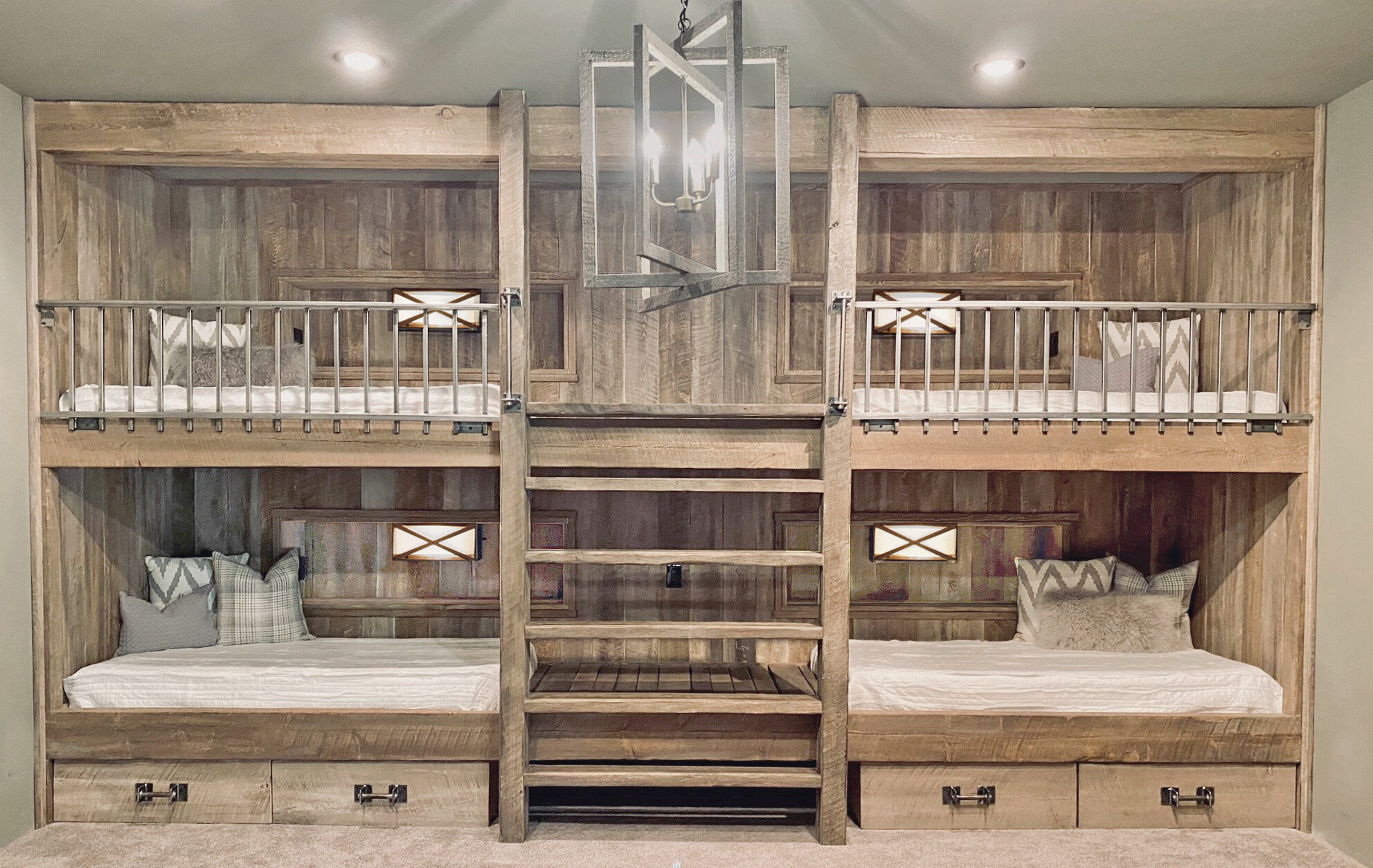
Bunk beds are such a practical upgrade to your home if you have kids, host many guests or slumber parties, or if you have a rental home. They are a stunning built-in feature to a bedroom and can really be a focal piece that can add value to your home or rental. Bunk beds are such a great space saving option as well and leave so much room for activities (of course I had to make a Step Brothers joke here)! In some cases, you can even add in storage drawers into the design of the stairs or underneath the beds. In one of my most recent bunk bed projects, we added in a cubby for each bed with its own switch to operate an individual wall sconce, a receptacle for charging electronics, and a shelf space to use as a nightstand. There are so many wonderful designs out there to inspire your next project. Here are a few of my favorites! 

Design by Sheer Interiors

Design by Sheer Interiors

Design by Brook Wagner Designs

Design by Brook Wagner Designs

Design by Studio McGee

Design by Studio McGee

Photo via Bedstation Hostel

Photo via Bedstation Hostel

Design by Becki Owens

Design by Becki Owens

Design by Sheer Interiors

Design by Sheer Interiors

Design by Cambridge Home Company

Design by Cambridge Home Company

Design by Becki Owens

Design by Becki Owens

Design by Amber Interiors

Design by Amber Interiors

Designing Your Feature Wall

There are so many ways to make a statement in your home. One of my favorite methods to add drama to a space is to include a feature wall. An accent wall brings attention to a focal area through texture and visual interest while making a space feel open and inviting. When it comes to materials, there are many to choose from to make a wall ‘pop’. Here are just a few of my front-runners.

Brick

Exposed, painted, or white-washed brick are all great options for an industrial look.

Design by Neptune Home

Design by Neptune Home

Quartz

Quartz or natural stone is a fabulous feature for a kitchen wall to make a timeless statement.

Design by Kate Marker Interiors

Design by Kate Marker Interiors

Stone

Stone is a great material to add to a focal wall to create an earthy, natural texture.

Design by Marie Laure Heimkampf

Design by Marie Laure Heimkampf

Built-Ins

Built-in cabinetry adds dimension and color to a focal wall in your living room, bedroom or office.

Design by Lydia Millen Home

Design by Lydia Millen Home

Paint

While I don’t often recommend large accent painted walls, in the right setting they can really be a nice feature.

Design by Kathy Kuo Home

Design by Kathy Kuo Home

Concrete

Concrete accent walls are a sleek and modern way of adding subtle texture to a space.

Design by Selector

Design by Selector

Metal

If you really want to make a powerful statement, metal accent walls add visual interest to a space, almost becoming a piece of art on the wall.

Design by Digs Digs

Design by Digs Digs

Artwork

If you want something less permanent in your space, try a collage art wall with lots of dimension and composition. 

Design by Coco Cozy

Design by Coco Cozy

Tile

A feature wall of tile is perfect for a kitchen or bathroom because it not only adds in color or pattern, but it also protects the walls from splashing water.

Design by New River Building Co.

Design by New River Building Co.

Wallpaper

Wallpaper has really changed over the years and the new patterns and textures they have now really add dimension and the prints are much more contemporary.

Design by Lindye Galloway

Design by Lindye Galloway

Wood

Raw or reclaimed wood have been all the rage lately as an accent wall in modern farmhouse and rustic designs.

Design by Allison Campbell Design

Design by Allison Campbell Design

Moulding

Painted geometric moulding or horizontal shiplap are popular accent choices because you can create patterns and use different colors to bring in dimension.

Design by Making Joy and Pretty Things

Design by Making Joy and Pretty Things

Color Me Coastal

While I may be a true Colorado girl these days, I still have a love for coastal design after living in Florida for over 20 years. I have a few adventurous and devoted clients who have trusted me enough to bring me along as their traveling designer to Puerto Vallarta, Mexico and Venice Beach, FL for a few seaside projects that have been a true inspiration. 

via Sheer Interiors

Easy Breezy

Coastal design, as described in my previous blog, encompasses the breeziness of the beach. This means that the design is light and bright and the overall feel is relaxing. Coastal design is clutter-free with simple, clean lines and a cohesive color palette.

via Sheer Interiors

Colors & Textures

When I am looking for inspiration for a color palette for seaside homes, I always look to, well, the beach! There you will find blues, greens, whites, creams, yellows and grays. These soft colors paired with lots of different textures become the components that make up the perfect waterfront paradise. In these lakefront or oceanside homes, you will find materials like rattan, wicker, weathered wood, jute and seagrass. I also incorporate white-washed woods, soft patterns and matte finishes. White, being a crisp and clean color, is always a dominate tone in my coastal designs. 

via Sheer Interiors

via Sheer Interiors

Accents

I love to bring in the vibes of the ocean through my smaller accents. I use elements like coral and dried grapewood or other botanicals to bring the feel of the outside in. One important thing to remember while designing your beachfront home is to not get overly ‘themey’. While I love to add in a few elements that have a strong costal feel to them, you don’t want to be too literal. This design style can speak for itself with the various colors and composition of the materials. 

via Sheer Interiors

Artwork

I think art in a costal home is one of the most important elements to curate. The artwork is the feature that brings in the visual interest and influences the rest of the design. Abstracts are the perfect way to bring in the feeling of the sunset or the ocean. I also love watercolors or paintings of seashells and coral.

via Sheer Interiors

via Sheer Interiors

The Views

Most oceanfront homes have spectacular views and large windows that let the natural light come in. I like to let my designs center around the view. The interior finishes should reflect and highlight the view, not take away from it. Plus, letting in a lot of natural light is key to the perfect beach home. 

via Sheer Interiors

The sea is the place where you go to relax and unwind so if you let your interior space be simple and calming, you will successfully achieve coastal design. All of this talk about the sand, sun and water sure makes me ready for my next beach vacation!

via Sheer Interiors

Happy Fourth of July

Happy Fourth of July from Sheer Interiors! I hope you all have a wonderful holiday weekend with your friends and family. May we all remember the amazing freedoms we have and be proud to live in this great nation. Today and everyday, be the best representation of what it means to be an American! Stay safe and enjoy yourselves. Here are a few fun ideas if you plan on entertaining this weekend. Cheers!

Design by Brooke Wagner Designs

Design by Brooke Wagner Designs

Design by Designthusiasm

Design by Designthusiasm

Design my Liz Marie Blog

Design my Liz Marie Blog

Design by The Lily Pad Cottage

Design by The Lily Pad Cottage

Design by The Savvy Southern Style

Design by The Savvy Southern Style

Design by On Sutton Place

Design by On Sutton Place

Design by Sweet Wood Creative Co

Design by Sweet Wood Creative Co

Design by Fletcher Creek Cottage

Design by Fletcher Creek Cottage

Design by Edith and Evelyn Vintage

Design by Edith and Evelyn Vintage

Design by Virginia Sweet Pea

Design by Virginia Sweet Pea

What's Your Design Style?

One of the things I love about interior design is how each individual expresses their taste in their own home. While many of us identify with a certain design style, often times we incorporate aspects of many different types of design in our homes. Sometimes we get hung up on which direction to pursue and I find that establishing a design style helps to start the process. Each of these unique design trends has certain characteristics but these can change over time and we adapt along the way using our own interpretations of these looks.

Coastal

Design by Post Box Designs

Design by Post Box Designs

Coastal design encompasses the breeziness of the beach. You will find a lot of neutral tones with pops of soft greens, blues and yellows. Coastal design incorporates a lot of texture using natural elements and wood tones. If you are looking to use pattern in this style, stripes are always a winner. Overall, these spaces tend to have a lot of natural light and should feel soothing and relaxing. 

Traditional

Design by Grace Kaynor Designs

Design by Grace Kaynor Designs

Traditional design comes to us from Eighteenth and Nineteenth century European decor. There are many warm colors, deep wood tones, and complex patterns used in these homes. You will find rich fabrics like velvets, silks and brocades on chairs and sofas with wingbacks, tufting and piping. In this style, there is depth in the layers of each room and lots of dimension overall.

Transitional

Design by River Bend Home

Design by River Bend Home

This is one of the most popular design styles because it is a mix of old and new (traditional and modern). This style is timeless because it is simple yet sophisticated. Here you will find mostly neutral colors with soft pops of color. Transitional homes have the cleaner lines of modern aesthetic without loosing all of the traditional details. In my opinion, this is a great happy-median design style. 

Contemporary

Design by Brooke Wagner Designs

Design by Brooke Wagner Designs

Contemporary style homes have a simple yet subtle sophistication. These homes have clean, straight lines and a quiet drama. Less is more here. You will see minimal and serene architectural elements paired with bold scale and sleek furnishings. In contemporary homes there are no unnecessary details. 

Scandinavian

Design by Studio McGee

Design by Studio McGee

Scandinavian design originated in Denmark, Norway and Sweden. This is one of my personal favorite design styles because there are clean, simple lines and these homes incorporate functionality without sacrificing beauty. There is more texture and pattern in this trend than contemporary design. Wide plank wood floors in lighter tones are used in these spaces along with neutral colors and pops of black. Scandinavian homes are cozy with warm, inviting textiles, simple accents and live greenery. 

Eclectic

Design by Kate Lester Interiors

Design by Kate Lester Interiors

Eclectic design is so much fun because it embraces a variety of periods of design history. These unique spaces are brought together with color, texture, shape and finish. When you have a juxtaposition of textures and contrasting colors, harmony is key. In this design style you can play with lots of different patterns and colors. You will find lots of unique artwork in eclectically designed rooms. There are no rules when it comes to this style but don’t get too busy with your design or your space will become haphazard and you won’t be able to appreciate the design. 

Industrial

Design by Tudo & Co

Design by Tudo & Co

If you are going for an industrial design style, think of a warehouse or an old factory. Many of these spaces have bare bricks, metals, and raw woods paired with salvaged materials. The whole idea here is to have stripped back architectural details. This style contains mostly neutral colors and you will find lots of leather, distressed wood and exposed ceilings. Industrial spaces are normally wide open with lots of large windows and statement light fixtures. 

Mid-Century Modern

Design by EST Living

Design by EST Living

Mid-Century Modern has roots in Germany but came to America through Bauhaus style. In this style, form follows function and functionality is key. You will find minimalistic design, free of clutter, with sleek lines and organic forms. Mid-Century Modern homes have limited ornamentation with lots of wood tones paired with metals and glass. There are a variety of fun colors in this style and normally you will see some retro artwork. One of the giveaways of this style is the tapered peg legs on the furniture. 

Modern Farmhouse

Design by Joanna Gaines

Design by Joanna Gaines

This design trend became popular when Joanna Gaines appeared on HGTV’s Fixer Upper. This style is a balance of rural and refined. Modern Farmhouse works for people who enjoy casual living, neutral color schemes, and lots of texture. This design style isn’t as rustic as traditional farmhouse design because there are clean lines, open concept kitchens and live greenery. Here you will find exposed wood, shiplap, distressed decor pieces and repurposed materials. 

Rustic

Design by Pearson Design Group

Design by Pearson Design Group

Rustic design contains raw, natural wood and unfinished elements. This style aims to bring the outdoors in through rugged, natural beauty and aged richness. Rustic homes tend to have vaulted ceilings with beams, stone or brick elements, and darker tones and finishes. These spaces are warm and inviting and have that ‘lodge’ feel. There are subtle hues in this style with a lot of texture and handmade, reclaimed pieces. 

The Home Office

Although these words may make you cringe now more than ever, the home office is not as dreadful as you may think! There are definitely some key strategies you can implement to make this space as functional and practical as you would like it to be. I highly recommend that you apply these tricks to your home office (or if you are back in your commercial office) in order to make sure that your space is performing for you!

via Black Band Design

via Black Band Design

via Studio McGee

via Studio McGee

Dedicated Space

Personally, I think this is the MOST important element of having a productive home office. You will never be successful with accomplishing your work if you are setup on a coffee table, recliner, kitchen island, or dining room table. I highly encourage you to invest in a desk and a quality chair and put it somewhere that you will be comfortable staying for a long period of time. For some, this is a spare room or nook in your home. Others enjoy looking out of a window. For me, I like to be in an open space but I like to face the wall so I am not disturbed. Play around with the placement of your desk until you feel that you are not distracted at all and you can solely focus on your work.

via Circa Lighting

via Circa Lighting

Lose the Distractions

Speaking of distractions, we all know that working from home presents its own challenges. Kids, pets, TV, laundry, dishes, spouses, roommates, home improvement projects, and daily tasks can all occupy our minds while we are working from home. I always try to dedicate an hour of my time in the morning and half of my lunch break to taking care of the day-to-day household chores. I always save my home projects for the weekend and make sure my pets are taken care of so I can focus on my work. For me, playing music in the background is a great way to shut out all the noise and remain focused. Kids, as we know, can be another story but we have to do what we can to make sure we dedicate our focus to the tasks at hand. I also advise you to make sure your TV is turned off while you are trying to work.

via Nicole Davis

via Nicole Davis

Ergonomics & Functionality

This is one of the most important, yet often overlooked, elements of a home office. I spent over two years working at a commercial office furniture retailer where I studied the proper way to sit at a desk. This might sound crazy, but YES, there is an exact science to how you are sitting at your desk. By making sure you are sitting and working correctly, you can reduce stress and potential future injuries caused by sitting in awkward positions. First, the top of your computer screen should be at eye level so you are not having to drastically bend your head down to focus on the center of your screen. Your armrests and keyboard should be level so your arms remain parallel to the floor. Your knees should be bent at a 90 degree angle and your feet flat on the floor. Also, make sure your back is supported and you are not bending or slouching at any time. You will find that these adjustments will really improve your motivation and help your productivity. 

via Allsteel

via Allsteel

Declutter & Organization 

This tip can be tricky for a lot of people who spend countless hours at their desk. I find the neater and more organized my space is, the more I am able to focus on my work. I understand the frustration of not being able to find the paper you are looking for or having to search through all of your desktop folders to find the right document. I feel that if you can organize your desk and office, make designated physical and digital folders, and keep your email inbox categorized and clear of unimportant emails, you will find that you are not being pulled away from your work. You can also try unsubscribing from spam emails or just leaving your email closed and only checking it every half hour to hour so your attention always remains on the current task. 

via Process Lighting

via Process Lighting

Aesthetics

Finally, your office should be a reflection of your home, taste and style. Don’t be afraid to invest in yourself and your office! Having the proper storage and materials will only help you to be more productive in the long run. Your office should be located somewhere that you want to be and a place that you gravitate towards. If your desk is worn down and junky, you won’t feel the desire to sit there and work! Remember, investing in a home office (really your entire home in general) is self-care and self-improvement. Upgrading your home only makes you feel and function better!

via Gold Coast Canvas

via Gold Coast Canvas

via Marie Flanigan Interiors

via Marie Flanigan Interiors

Climbing The Ladder

When I was a kid, I always loved climbing and exploring! I try to embrace my inner child in certain elements of my designs because I think it is important to incorporate a certain playfulness in the right space. After all, who doesn’t love to have fun in design and let their creativity flow?!

via Studio McGee

via Studio McGee

Visual Interest and Dimension

It is so important to add layers and dimension to your space. Without dimension, your design will fall flat and become lackluster and dull. I feel the best way to bring in texture is through your art and accessories. They can be the element that brings the whole design together. A ladder can be an exciting way to add a pop to your space and bring life to an otherwise flat run of cabinetry or wall space. 

via Jean Stoffer Design

via Jean Stoffer Design

A Hint of Whimsy 

Whenever I think of rolling ladders, I think of the library in Beauty and the Beast. Who hasn’t dreamed of having a grand space full of books as far as the eye can see? Adding in a ladder is the perfect way to add a little bit of fun and whimsy to your home library. They are also very functional for those top shelves that are hard to reach!

via Kimberley Kay Interiors

via Kimberley Kay Interiors

Raising the Height of Your Space

Speaking of top shelves, if you are anything like me, it is difficult to reach some of the items at the top of your pantry or on the higher shelves of your kitchen cabinets. If you incorporate a ladder rail along the tops of all of your cabinets, you can access anything you need and you have the potential to raise the height of your ceilings and cabinets if you are doing a new construction or remodel project. I always try to make my cabinets touch the ceiling when possible. If you think the ladder will get in the way, you can always add a small hanging spot on the side of your cabinet run to store the ladder when it is not in use.

via Gather Projects

via Gather Projects

via Trove Warehouse

via Trove Warehouse

Decorative Elements

I always try and include three-dimensional decorative elements into my design. It really makes your space come alive. With a ladder, you have so many options for the finish and the construction. The design opportunities are endless. A decorative rolling ladder is essentially a piece of art in your space. It is a sculptural element that is also functional while bringing the whole design vision together. 

via Studio McGee

via Studio McGee

Designer Unknown

Designer Unknown

Versatility 

One of my favorite things about a rolling ladder is how versatile they are! You can add one in your kitchen or pantry design. They work perfectly in a home office or library space. They are also very practical in a closet or even a home bar! The options are limitless and the fun is contagious! If you decide to incorporate one in your design, please share your pictures with me! I hope you all have a fantastic Memorial Day Weekend!

via Raw Creative of Aurum Food & Wine in Breckenridge

via Raw Creative of Aurum Food & Wine in Breckenridge

Why Hire a Designer?

Many people have misconceptions about hiring an interior designer to help with their projects. I am here to clear up some of these and to explain why it is so beneficial to have a designer on board with your home projects.

IMG_0295.JPG

If you wanted to install a new plumbing fixture in your home and you have no clue how to do so, you would call a plumber, right? There are so many advantages to hiring a professional to help you with any project. They have specialized knowledge in their field that can add a lot of value to your project. As a designer, I am constantly saving people money or sharing trade secrets that immensely help my clients with their projects. I have been in the industry for over seven years and I have seen a lot of people make mistakes before they call me. My job is to help save you from making those costly mistakes, all while providing valuable insight in to the design process and helping you create a beautiful space. 

IMG_0296.JPG

Many people believe that interior designers are extremely costly and it would make their project too expensive if they hire help. I am here to tell you that this is simply untrue. Personally, I work based on an hourly system so there is no project too big or too small to involve me on. I always feel that my relationships with my clients should be a great fit for us both and my hourly system allows them to try out my services without being roped into a huge financial commitment.

IMG_0294.JPG

Speaking of small projects, a huge aspect of my business is paint consultations. I have helped so many individuals who struggle to pick the perfect color and when you are investing quite a bit of time and money towards painting a space, you want to feel 100% confident that you have the right color. I have so much experience in selecting paint colors that I have even created my own ‘100 Favorite Paint Colors’ fan deck.

via Sheer Interiors

Another great way to utilize a designer’s services is through re-designing and re-styling. A lot of clients really see the value in having a fresh set of eyes come in and help them make their home or space more functional. A designer like myself can even assist with decluttering or just simply moving some art and decor pieces around to give your home a slight facelift. My job as a designer is to throw out as many ideas as I can think of and then you can decide what makes sense for your lifestyle. 

via Sheer Interiors

via Sheer Interiors

It is so important to me that my clients feel like their taste and style is represented in the design of their home. I like to make sure they have as much input as they would like in the process so their space reflects their taste, style, and personality. 

via Sheer Interiors

via Sheer Interiors

I love to help people accomplish their goals and make their home a haven. Whether it is Sheer Interiors, or another design firm, I urge you to consider taking advantage of the experience and knowledge a designer can provide for your next home project. During these times, if you feel more comfortable working virtually, please reach out to me for more information on my E-Design services.

IMG_0104.jpg

Eight Stay-At-Home Projects

As we continue to stay home and stay safe, many of you have probably considered taking on a few home projects. Now is the perfect time to focus on making improvements to make your home more functional and enjoyable. I always find that diving into a project helps to pass the time and keep yourself occupied. 

via Studio McGee

via Studio McGee

One of the easiest and most effective ways to completely transform a room is with paint. I like to use lighter colors to keep the room feeling bright and open. I try to stick with 3 to 5 colors to encourage flow and to keep the home feeling cohesive. One of my favorite paint colors is Classic Grey by Benjamin Moore. It is the perfect off-white in my opinion because it has a little grey, a little cream, and reflects the colors around it (shown in the picture above).

via California Closets

via California Closets

Our closets tend to be one of the most neglected spaces in our home. I try to organize and declutter my closet at least twice a year. One tip that has always stuck with me is to turn all of your hangers around at the beginning of the year. Once you wear the garment, return the hanger to its original position. If you haven’t worn something in a year and the hanger is still turned the opposite way, it may be time to donate!

via Lindye Galloway

via Lindye Galloway

We all have family photos or pieces of art lying around that we aren’t sure what to do with. I love hanging a gallery wall with personal photos or creating an art wall with coordinating pieces. I recommend laying the pieces out on the floor or even a large piece of butcher paper so you can play with the design until it’s perfect. To make it easier, outline the art on the butcher paper, mark the hanging spot, and tack the paper to the wall so you can make all of your holes at once. 

via Cambridge Home Company

via Cambridge Home Company

If you are tired of the same look in your bedroom, try updating your bedding. I like to use a neutral base and then I can add on pillows and blankets with different colors and patterns on top to create a new look. This makes it easy to swap out pieces as you grow tired of them or change the look for each season.

via Styled by Fliss

via Styled by Fliss

Pantries are a simple space to tackle and can easily be organized with storage containers, baskets, and labels. If you are someone who likes to change up what’s stocked in your pantry, try using chalkboard labels. This organizational system is a great tool for keeping track of food that has gone bad and keeps items all in view so nothing gets hidden in the back.

via Modern Nest

via Modern Nest

Do you have several accessories and decor pieces floating around that you haven’t used in a while? Try rearranging your bookshelves to bring new life to your home and change up the look of your space. It is amazing what a few little changes can do to revive a room.

via Bria Hammel Interiors

via Bria Hammel Interiors

If your home came with some lighting fixtures that you don’t care for, it is time for an upgrade! There are so many shapes, finishes, and sizes of light fixtures that you can incorporate into your design. I love large pendants because they can be hung in pairs over a kitchen island or a dining room table to add visual interest.

via Our Faux Farmhouse

via Our Faux Farmhouse

Finally, I am sure most of you are working from home for the first time and many of you have probably set up shop on your dining room table. In my opinion, this can be uncomfortable and can be a distraction. This is the perfect time to find a dedicated home office space with a desk and an appropriate office chair. This will boost productivity and can be a great place to work at in the future.

Pour Decisions

If you are anything like my husband and me, you have probably enjoyed a few alcoholic beverages during this long period of social distancing and staying at home. We are enrolled in a few wine clubs that have allowed us to sample different bottles and see which flavor profiles best suit our palates. For us, finding wines we enjoy isn’t the problem, it’s where to store them all! Many people choose to incorporate wine storage in their home through many exceptional ways.

via Lindye Galloway Interiors

via Lindye Galloway Interiors

via Humphrey Munson

via Humphrey Munson

Some homeowners choose to display their wine using a freestanding furniture piece that they can take with them when they move. Others choose to incorporate a built-in piece that coordinates with their kitchen cabinets or can be tucked away in their butler’s pantry. This can be achieved with a decorative wine rack or even just a wine cooler nested perfectly in a run of cabinets.

via Canny Group

via Canny Group

via Brooke Wagner Design

via Brooke Wagner Design

One of my favorite ways to display wine in a home is by incorporating a wine cellar into the design. Some designers build this into the empty space underneath the stairs, while some choose to just use an architectural door to conceal the space. I have even seen these rooms become a open and focal centerpiece in a living, dining or entry area.

via Lindy Galloway Interiors

via Lindy Galloway Interiors

via Architectural Digest

via Architectural Digest

via Lindye Galloway Interiors

via Lindye Galloway Interiors

If you are really feeling creative, you can use a hidden entry or even a door built into the floor! There are endless ingenious and unique ways to proudly display your fabulous collection.

via Lisa Price Interiors

via Lisa Price Interiors

via Humphrey Munson

via Humphrey Munson

Now, all you will need are a few good friends and a couple of cheese plates and you’ve got yourself a party! Cheers!